6 Menu Design Tricks Restaurants Use to Make You Order More and Expensively
Every sphere has its own untold rules and the restaurant business is no exception. Each time we order food, we have to use a menu, so this becomes a powerful tool that influences and directs our choices. And while we really just want to grab a bite, we might end up with our eyes being bigger than our stomachs.
We at CHEERY were curious about some of the secrets that restaurants use to influence our decisions.
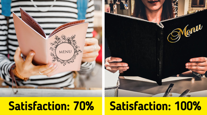
1. The weight of the menu influences our perception.
Research says that your impression of the food starts the moment you hold the menu in your hands. Heavier menus leave a better impression, making us believe that the service in the restaurant will be at the highest level. While light ones make people wonder whether this place is casual and “economy.” So the next time you hold a leather menu with good paper, don’t be fooled, it has nothing to do with the quality of the food or the service.
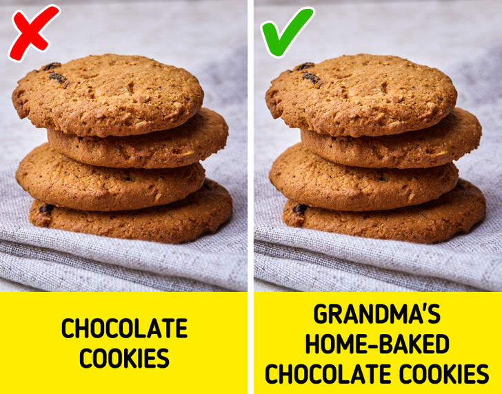
2. Some names of dishes can make you hungry.
The name can make a certain dish up to 23% more popular. Research showed that indulgent, exciting names increased the number of people who chose certain food. Another way restaurants use names to make you choose certain food is by giving them nostalgic labels like “handmade,” or “Grandma’s home-baked” which gives you positive emotions.
3. Font influences the way we perceive food.
Depending on the font used, the menu can convey different messages. Visitors who were reading an italicized menu perceived the restaurant to be more upscale with top-notch service. While simple, easy-to-read fonts can be associated with “cheapness” and “economy.”
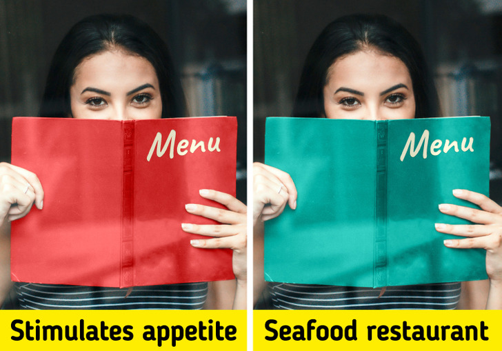
4. Colors inside the menu send signals too.
The colors you see on a menu also have a huge influence, since people respond emotionally to them. Red and blue are the most popular colors that restaurants use when they want to trigger and increase your appetite. What they will do is highlight in color and with bigger letters the main items on their menu. These colors call for your attention. In seafood restaurants, blue is usually the chosen color for the menus since it indicates that the food served comes straight from the sea.
5. A few photos will make you buy more.
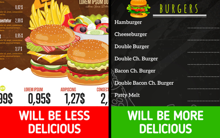
The old saying people eat with their eyes isn’t always true. While visuals are important, a menu design specialist says that too many pictures can make us believe that the restaurant is a low-end eatery. Our spending increases by 30% when we see just one picture per page. Often, expensive restaurants prefer to leave the quality of the food to the visitor’s imagination.
6. Chaotic menu layout makes us spend more
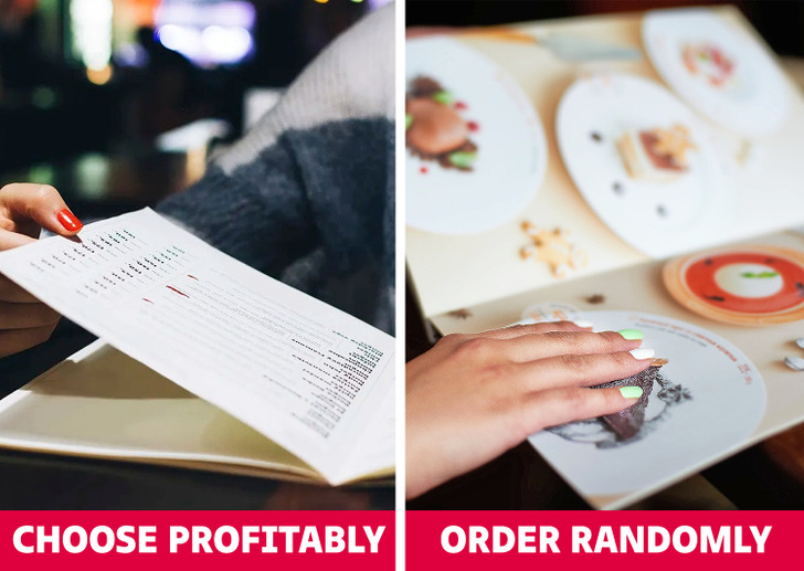
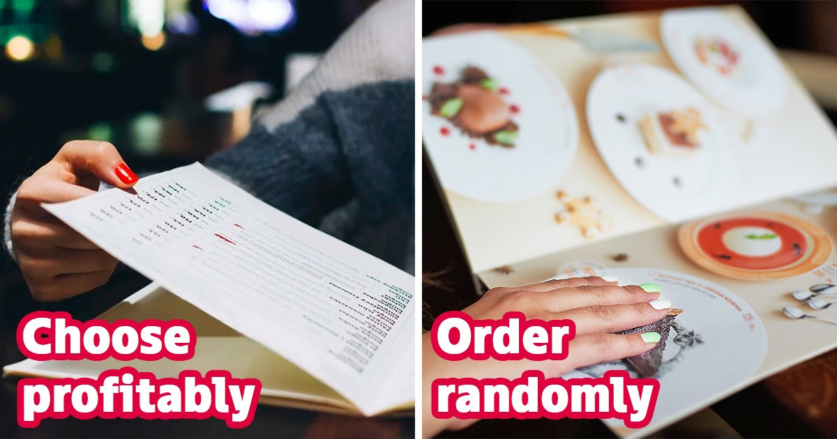
Restaurants that list prices to the right of the name and description of a dish allow you to compare and сhoose profitably. If prices are everywhere on the menu, especially mixed with images, you have to order randomly. After all, no one will write out prices and composition in order to understand what you have to pay more for.
Do you enjoy eating out? Are there any other restaurant tricks that you know of? We’d love to hear about your experience!
