10 Common Mistakes to Avoid When Decorating Your Living Space
Having the home of your dreams goes beyond how big or luxurious a house is. It’s really about how happy you are in the place you’ve created. To that end, the elements you have inside, like furniture and decor, are critical. But perhaps you’ve seen beautiful boards on Pinterest and gotten frustrated because your home doesn’t look exactly the same.
CHEERY likes to look at the beautiful side of things and, incidentally, help inspire you to do those projects that could improve your lifestyle and take you to a happier place. That’s why we’ve put together these tips to update your home and make it more pleasing to the eye.
1. A dark, secluded area
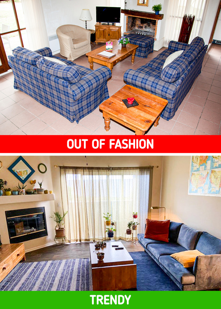
The living room is a meeting and gathering space for family and friends. It’s typically one of the rooms that you spend the most time in when you’re socializing with others. That’s why it’s so important for this room which, in the last century, used to be sort of dark and dreary, to be easily accessible and inviting.
Your goal today is to enhance the natural light that your living room has. To do this, you can, for example, remove walls and make a single space with other parts of the house, like the kitchen or the dining room. You can also paint the furniture and walls white to project more light and create a feeling of openness.
2. Outdated shelves
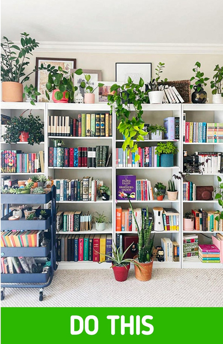
People who like reading regularly may often face problems with space at home. After all, books, bookshelves, and bookcases can take up a lot of room. And while we can sometimes convince ourselves that a space will look better with books, that’s not really the case. Using dark wood for your shelves and overcrowding your house with books just makes it look like an old dresser.
Taking tips from Marie Kondo’s method, you may want to pare down your book collection a bit and arrange them according to your priorities. You can start by choosing your favorites. Choose the ones that have left an impression on your life and that you could read a thousand times. Then there are also books you bought but haven’t read, and finally, books you simply don’t want to keep anymore. Take years off your bookshelves by painting them in light or vibrant colors.
3. Macramé of the last century
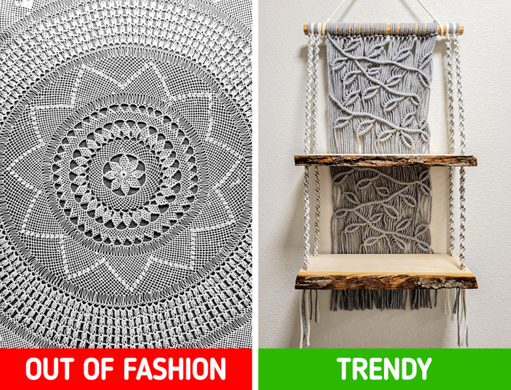
Everybody has one of those macramé hand-knitted decorations at home. While they may have sentimental value for many since they were likely made by your aunt or grandmother, consider that most of these are out of fashion. Not only do they gather dust and detract from the style of a room, but they are also objects with no practical use.
If you are too sentimental to say goodbye to this type of age-old gift, you could try and find a new function for them. For example, you could use them as a very fancy bedspread or a macramé for hanging plants, and your home will have a new cool boho-chic style.
4. Painting the walls in dark or too vibrant colors
Before deciding what color you’ll use to paint the walls, like the ones in your living room, ask yourself the following question: Even if you really like that color, do you think it would look great on all the walls in your living room?
Painting all the walls with one color makes the whole room look somewhat oppressive because the corners tend to disappear. Plus, you will have to maintain them constantly if cracks appear or if the paint peels off. Instead, go for neutral tones. These will allow light to reflect on things and withstand the test of time.
5. Old and short curtains
If you want to give a modern feel to your home, choose long curtains. When in doubt, always go for long (even puddled) curtains instead of short ones that are typical of kids’ bedrooms. As we mentioned before, if they drag, it’s even better. Lose your fear of fabric and choose neutral tones that allow light to pass through to brighten up the room and remove a bit of “weight” from your interior decoration.
6. Poor artificial lighting
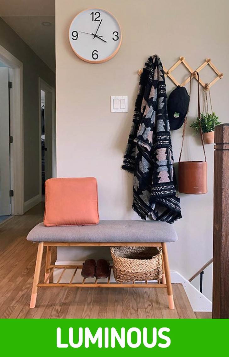
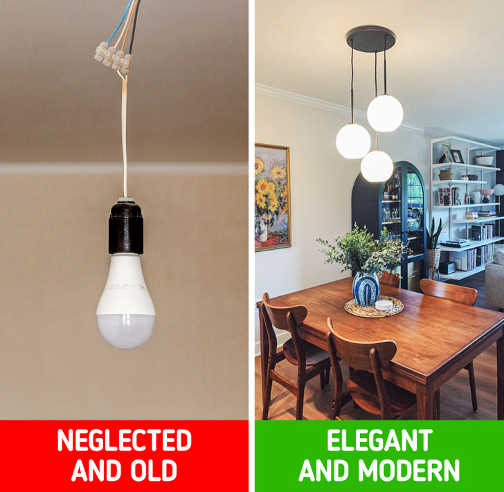
Forget about old overhead light bulbs and go for light that can be projected in different parts of the room. Multiply the sources of light, either by using floor lamps or by installing table lamps here and there. Their main purpose should be to add a special touch or to highlight a particular area of the room where you want to draw people’s attention, with a contrast between the lighter and darker aspects of the room.
7. No natural elements
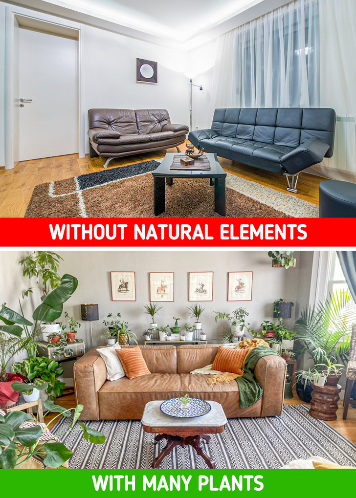
Having plants at home has become a huge trend among Millenials, and the truth is we should be thankful that’s the case. Not only do they help clean the air in the areas of your home, but they also give them a super trendy green touch, which makes any corner look great. A fresh and modern house should have some plants in it.
8. Not getting rid of imperfections
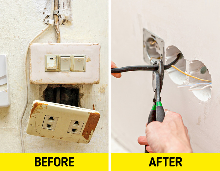
Stains on the wall, cracks, loose wires, broken sockets, or unpainted walls can not only be dangerous features, structurally speaking, but they also make your home look like a construction site. If you think your home has become outdated or unaesthetic, then consider a renovation within your budget. If you’re short on money, you can always spend some time fixing the basic issues yourself unless we’re talking about real damage that should be taken care of by a specialist.
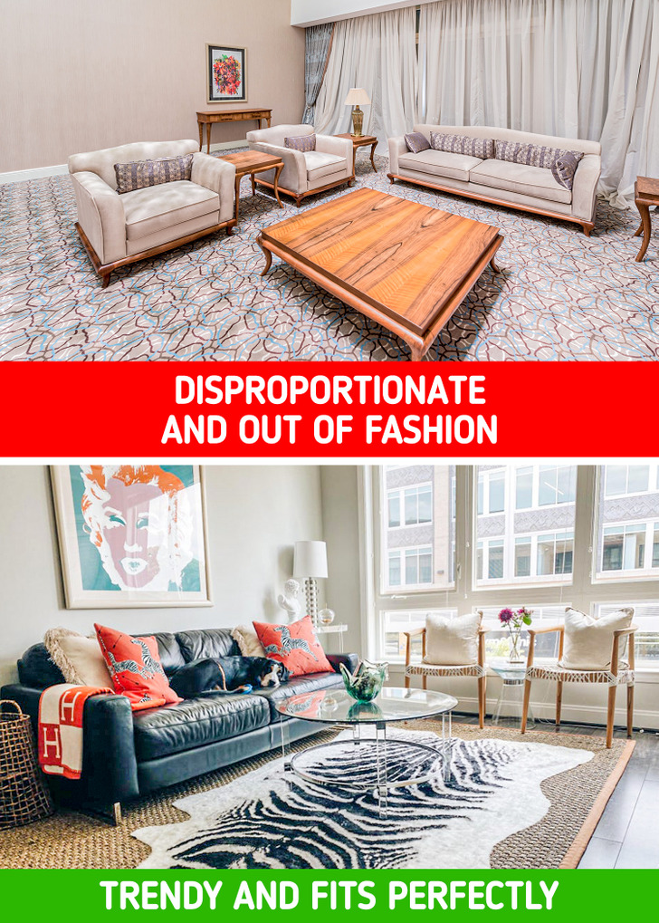
9. Unproportionate carpets
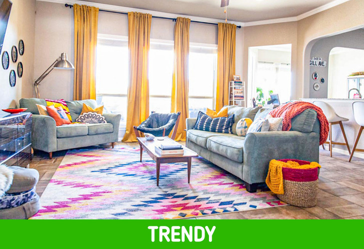
Please say goodbye to carpet stuck to the floor or old, dirty carpeting that came with the house you just bought. Rugs should always be designed according to the layout of the area you want to place them in. Look for inspiration in basic colors that you can combine with other decorative elements within the room, creating a colorful and harmonious environment.
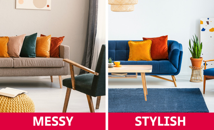
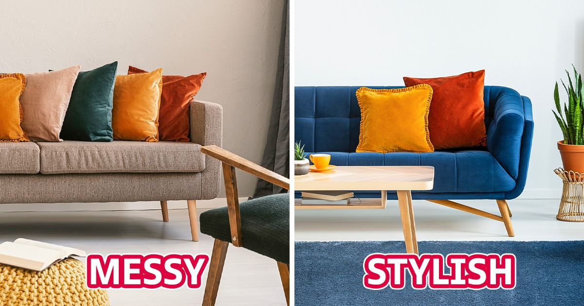
10. Having too many decorative pillows on the sofa
Bedroom might be a perfect space for using as many pillows as you wish. But it is better to stick to minimal numbers when it comes to the sofa in living room. Putting a lot of decorative elements in this space will make a messy impression. Besides, it is just uncomfortable to sit on such a sofa, when you can not find any free space.
What elements of your home do you think are tacky or make it look dated? Would you have a hard time getting rid of them? Why?
